The Secret to Creating Click-Worthy YouTube Thumbnails in 60 Seconds
Why Most Creators Waste Hours on Thumbnails That Nobody Clicks
I used to treat thumbnail design like a high-stakes art project.
I would agonize over fonts. I would tweak the saturation by single percentages. I would spend three hours inside Photoshop for a single asset. And you know what happened?
Nobody clicked.
It was heartbreaking. But it taught me a brutal lesson about the content game. The internet does not care about your artistic perfectionism. The internet cares about clarity, emotion, and instant recognition.
Through years of trial and error analyzing thousands of data points across multiple platforms, I realized that the highest-performing visuals often take the least amount of time to make. In fact, if you're taking longer than sixty seconds to conceptualize and build your thumbnail foundation, you're probably overthinking it.
This guide reveals the exact framework I use to design click-worthy thumbnails in under five minutes. No complex software required. No design degree necessary. Just proven principles that generate results.
The "Squint Test" and The Color Pop Strategy
Here's a reality check: Most people are not seeing your work on a 27-inch 4K monitor. They're seeing it on a cracked smartphone screen while riding the subway, scrolling through hundreds of competing thumbnails in a single session.
Your image needs to scream.
I call this the Squint Test. If you squint your eyes and look at your thumbnail image, can you still tell what the subject is? Can you identify the main visual element? If the answer is no, start over.
Why High Contrast Imagery Dominates Click-Through Rates
You need high-contrast imagery. This isn't the time for subtle pastels or moody lighting that works beautifully in art galleries but dies on digital platforms. You want vibrant colors that punch through the white or black background of the platform interface.
Ensure your subject stands out aggressively against the background. If the background is busy, blur it using any basic editing tool. If the subject is dark, stroke it with bright lighting or add a contrasting outline. Create visual separation that makes your thumbnail impossible to ignore.
The Color Psychology Framework for Thumbnails
Different colors trigger different psychological responses:
- Red: Urgency, excitement, danger (perfect for "breaking news" or "urgent update" content)
- Yellow: Optimism, energy, attention (ideal for "how-to" tutorials and educational content)
- Blue: Trust, stability, professionalism (excellent for business and finance topics)
- Green: Growth, health, success (works well for fitness and personal development)
- Orange: Creativity, enthusiasm, action (great for DIY and creative projects)
- Purple: Luxury, wisdom, mystery (suited for premium content and storytelling)
Choose your primary color based on the emotional response you want to trigger, then use its complementary color for maximum contrast.
Stop Writing Novels on Thumbnail Images
This is the most common mistake I see rookies make. They try to put the entire title into the thumbnail text overlay.
Spoiler: It looks terrible and kills your click-through rate.
The text on your image has one job: It's there to complement the title, not repeat it. Your title and thumbnail should work together as a cohesive unit, with each element adding unique value.
The Three-to-Six Word Rule for Thumbnail Text
If your title is "How to Run a Marathon in Under 3 Hours," your thumbnail text should simply say "SUB 3 HOURS" or "RUN FASTER."
Typography Best Practices for Maximum Readability
- Use ALL CAPS for maximum impact
- Add a thick stroke or shadow to ensure readability on any background
- Avoid script fonts, serif fonts, or anything with thin lines
- Stick to one or two fonts maximum per thumbnail
- Ensure text takes up at least 30% of the visual space
- Place text in the upper two-thirds of the frame where eyes naturally land first
The goal is instant comprehension. Viewers should understand your message in under 0.3 seconds.
Eye Contact is Currency: The Psychology of Faces in Thumbnails
We are simple creatures. Evolution has wired our brains to look for other humans. Specifically, we look for eyes and emotions in our environment as survival mechanisms.
This is why the "YouTube Face" phenomenon is a thing. It works because it taps into fundamental human psychology.
How to Use Facial Expressions to Triple Your Click-Through Rate
Include close-up shots of faces in your thumbnails whenever possible. But don't just stare blankly at the camera. Convey a specific emotion that matches the payoff of your content:
- Surprise: Wide eyes, open mouth (perfect for "shocking" or "unbelievable" content)
- Fear: Concerned expression, raised eyebrows (ideal for warnings or cautionary tales)
- Joy: Genuine smile, engaged eyes (great for success stories and positive outcomes)
- Confusion: Furrowed brow, questioning look (excellent for "why" and "what" explainer content)
- Anger: Intense gaze, set jaw (works for controversial or debate-style content)
- Curiosity: Tilted head, intrigued expression (perfect for mystery or investigative topics)
These emotions act as a psychological hook. They bridge the gap between the viewer scrolling and the viewer clicking.
The Rule of Thirds for Face Placement
Position faces according to the rule of thirds. Place the eyes at the top third line of your thumbnail for maximum engagement. This composition technique has been proven across photography, film, and digital media to create the most visually appealing and attention-grabbing images.
The Art of The Curiosity Gap: Visual Storytelling That Converts
A pretty picture is nice. A picture that tells a story is profitable.
The best thumbnail creatives use visual storytelling to open a "curiosity gap" in the viewer's mind. The image should hint at the content but leave the conclusion unresolved. It makes the viewer think, "I need to know what happens next."
Creating Visual Tension Through Composition
Combine storytelling with simple composition. Clutter is the enemy of curiosity. A single strong focal point with a clean background is infinitely more powerful than a chaotic collage with multiple competing elements.
Give the eye a place to land immediately. Use visual hierarchy to guide attention:
- Primary element: The main subject (usually a face or product)
- Secondary element: Supporting visual or text overlay
- Background: Clean, blurred, or solid color to avoid distraction
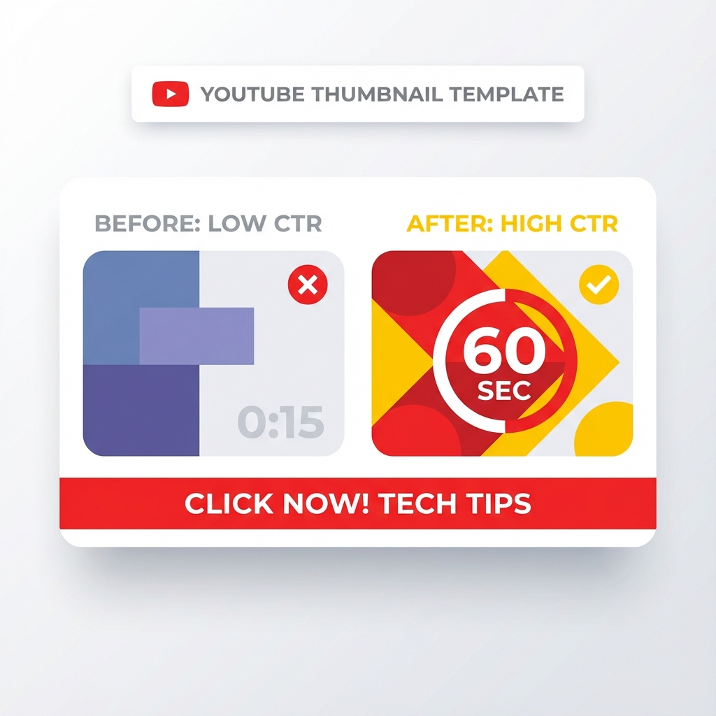
Before-and-After Thumbnail Strategy
One of the highest-converting thumbnail formats is the split-screen before-and-after comparison. This works exceptionally well for:
- Transformation content (fitness, makeovers, renovations)
- Tutorial content (showing the problem and solution)
- Comparison content (product A versus product B)
- Time-lapse content (beginning state versus end state)
Subtle Branding Wins the Long Game
Finally, there's the matter of legacy and recognition. You want people to recognize your content before they even read your name or channel title.
Incorporate subtle consistency across all your thumbnails. Maybe it's a specific color grading scheme. Maybe it's a small logo in the corner. Maybe it's a specific font family you use exclusively.
Building Visual Brand Recognition
Successful creators use these consistent branding elements:
- Color scheme: 2-3 signature colors used across all thumbnails
- Font pairing: Same font combination for headers and subtext
- Logo placement: Consistent position (usually bottom right or top left)
- Border style: Thin colored border or shadow effect
- Filter preset: Same color grading or filter applied to all images
Free Tools for Fast Thumbnail Creation
You don't need expensive software to create professional thumbnails. These free tools deliver professional results:
Canva (Free Version)
Canva offers thousands of thumbnail templates optimized for every platform. The free version includes:
- Drag-and-drop interface
- Pre-sized templates for YouTube, Instagram, TikTok
- Stock photos and graphics library
- Text effects and overlays
- Background remover (limited free uses)
Photopea
This free browser-based tool mimics Photoshop functionality:
- Layer-based editing
- Advanced text effects
- Filter and adjustment layers
- Supports PSD files
- No account required
Thumbnail A/B Testing: The Data-Driven Approach
Creating one thumbnail and hoping for the best is amateur hour. Professional creators test multiple variations to find winners.
How to A/B Test Thumbnails Effectively
Most platforms now offer built-in A/B testing features. YouTube, for example, allows you to test up to three thumbnail variations simultaneously. The platform automatically rotates them and tracks which generates the highest click-through rate.
Test these variables:
- Face versus no face
- Different facial expressions
- Text placement (top versus bottom)
- Color schemes (warm versus cool)
- Image cropping and composition
- Amount of text (minimal versus descriptive)
Run tests for at least 7 days or until you reach statistical significance (typically 1,000+ impressions per variation).
Reading Your Analytics to Improve Future Thumbnails
Pay attention to these metrics:
- Click-through rate (CTR): Percentage of impressions that result in clicks
- Average view duration: Whether clickbait thumbnails cause early drop-off
- Traffic sources: Which platforms and placements perform best
- Audience retention: Whether your thumbnail accurately represents content
A thumbnail with a 10% CTR is exceptional. Anything above 5% is solid. Below 2% indicates your thumbnail needs significant improvement.
The Sixty-Second Thumbnail Workflow
Here's the exact process I use to create thumbnails in under sixty seconds:
Step 1 (10 seconds)
Choose the hero image (usually a high-quality face shot or product image)
Step 2 (15 seconds)
Apply contrast boost and saturation adjustment to make colors pop
Step 3 (20 seconds)
Add text overlay with 3-6 word hook in bold sans-serif font
Step 4 (10 seconds)
Add text stroke or shadow for readability
Step 5 (5 seconds)
Apply brand elements (logo, color filter, border)
Total time: 60 seconds from blank canvas to exported PNG file.
Speed creates momentum. Perfection kills it. Simplify your process and watch your metrics climb.
Common Thumbnail Mistakes That Tank Your Click-Through Rate
Mistake 1: Too Much Visual Complexity
More elements do not equal more clicks. In fact, visual clutter confuses the viewer and causes them to scroll past. Stick to one clear subject, one text overlay, and one call-to-action maximum.
Mistake 2: Poor Image Quality
Blurry, pixelated, or low-resolution images destroy credibility instantly. Always use images that are at least 1920×1080 pixels. Export at maximum quality settings. Compression artifacts are unacceptable in 2026.
Mistake 3: Misleading Clickbait
Yes, clickbait thumbnails can boost initial CTR. But if your content doesn't deliver on the thumbnail promise, viewers will click away within seconds. This destroys your average view duration and signals to platform algorithms that your content is low quality.
Mistake 4: Ignoring Platform-Specific Requirements
Each platform has different optimal thumbnail dimensions:
- YouTube: 1280×720 pixels (16:9 ratio)
- Instagram: 1080×1080 pixels (1:1 ratio)
- TikTok: 1080×1920 pixels (9:16 ratio)
- Facebook: 1200×630 pixels (1.91:1 ratio)
Mistake 5: Copying Competitors Exactly
While studying successful thumbnails in your niche is smart, directly copying their style makes you forgettable. Viewers won't be able to distinguish your content from the creator you copied. Develop your own visual signature.
The Psychology of Color Combinations That Convert
Certain color pairings generate higher engagement than others. Use these scientifically proven combinations:
High-Contrast Pairings
- Black background with yellow or orange text
- White background with red or blue subjects
- Dark blue background with bright yellow elements
- Dark green background with pink or orange accents
Complementary Color Theory
- Red and green (Christmas, urgency)
- Blue and orange (trust meets energy)
- Purple and yellow (luxury meets optimism)
- Pink and teal (modern, trendy aesthetic)
Avoid color combinations that reduce readability:
- Yellow text on white backgrounds
- Light gray on white backgrounds
- Dark blue text on black backgrounds
- Red text on green backgrounds (accessibility issue for colorblind viewers)
Mobile-First Thumbnail Design Philosophy
Over 70% of video content is now consumed on mobile devices. This fundamentally changes how you should design thumbnails.
Mobile Optimization Checklist
- Preview your thumbnail at actual mobile size before publishing
- Ensure text is readable when thumbnail is 320 pixels wide
- Avoid thin lines or small details that disappear on small screens
- Use fewer elements to prevent overcrowding on limited screen real estate
- Test on multiple devices (iPhone, Android, tablet)
What looks amazing on your desktop monitor might be completely illegible on a smartphone. Always design for the smallest screen first, then scale up.
The Bottom Line: Simplicity Scales, Complexity Fails
The most successful thumbnails share one common trait: simplicity.
They communicate one clear idea. They use one dominant color scheme. They feature one focal point. They include minimal text.
Stop overcomplicating your thumbnail creation process. Stop obsessing over minor details that viewers will never notice. Stop trying to be an artist when you need to be a marketer.
Your thumbnail has one job: get the click. Everything else is secondary.
Design with clarity. Test with data. Iterate based on results. Your click-through rate will reflect your discipline.
Build Your Thumbnail Swipe File
Download HD thumbnails from top creators to study what works
Download Thumbnails Free →